TurboTax Monetization / 2025-2026Designing a framework for AI-driven ad personalization
RoleXD Driver
Timeline7 months, 2025-2026
PlatformsDesktop + Mobile web, iOS, Android
5.72%
Take rate
$5.8M
Revenue contribution
CONTEXT
Problem space
The issue with TurboTax’s monetization model
In-product upsells generate over $250M in annual TurboTax revenue, and are also the single largest driver of customer dissatisfaction and defection. Among customers who rated their experience 4/10 or below, nearly 70% cited pricing or upsell-related friction in their feedback.
“I dislike all the upsells. They seem to get more + more each year. Ask me once and then stop.”
“Powerful software that gets the job done, but the experience involves too many upsell prompts”
“Asked too many times to upgrade. If I wanted to upgrade, I would have chosen that option.”
The existing monetization experience was hardcoded so that upsells would always surface at specific, fixed locations in the product flow, pulling from a pool of 4-5 different static offer screens. Customers would see the same formats and content regardless of their context or needs, leading to a highly repetitive and frustrating experience. The rapidly changing competitive landscape and increasing defection rates became impossible to ignore, and a strategic shift was needed.
How might we move from static upsells to a monetization experience that’s personalized for each customer?
Key cross-functional teams
TurboTax's in-product monetization track is a complex space where several different teams intersect. The working team for this project included ~40 people, coming from a few key teams:
The THOR team was created to address upsell personalization. THOR is the name of the ML model at the center of it: in its ideal state, the model would be able to ingest customer signals as they move through the filing flow and decide what offer to show, where, and when. The team is cross-functional, composed of a driving PM, AI engineers, web-ops devs, data scientists, and myself as the primary designer.
The Commercialization and Monetization strategy teams steer TurboTax’s broader monetization direction, and are made up of marketing managers, data scientists, growth strategists, and PMs. In addition to the THOR initiative, there was another key bet at play: Upsell Modularization. The Modularization team’s mission was to break apart TurboTax’s existing bundle offers into individual benefits as standalone add-ons, betting that a segment of customers would be more willing to purchase benefits a la carte. Expert Final Review (EFR), a one-time expert review before filing, was the first product to come out of this bet. THOR and Modularization are deeply intertwined: new modular offers need a smarter delivery mechanism, and THOR needs new offer types to expand its training pool. I was the primary designer on both tracks simultaneously.
The Engineering team owns the technical implementation and backend architecture supporting our monetization experiences - composed of engineers, architects, technical program managers, and data scientists. I partnered with the team closely to understand the constraints and feasible scope while still pushing for an ideal experience.
The extended team also included frontend Web-ops devs, legal counsel, design directors across other dependency teams, and an exec sponsor.
Going broad
Determining strategy and scope
I started with an internal and external competitive audit.
In May of 2025, we kicked off with the modest goal of launching an initial MVP by October. This would allow us to test the demand for Expert Final Review with late tax filers who might be lagging due to complex situations. My first challenge - deciding on the optimal upsell format to drive the maximum amount of take and attach.
While TurboTax had been using the same fullpage comparison chart (‘Comp chart’) upsells for nearly everything, our competitors had much more robust, flexible frameworks - allowing them to utilize different formats for different contexts. Embedded cards for standalone offers, banners for limited time offers, full page offers for major service level upgrades and bundles, and so on…
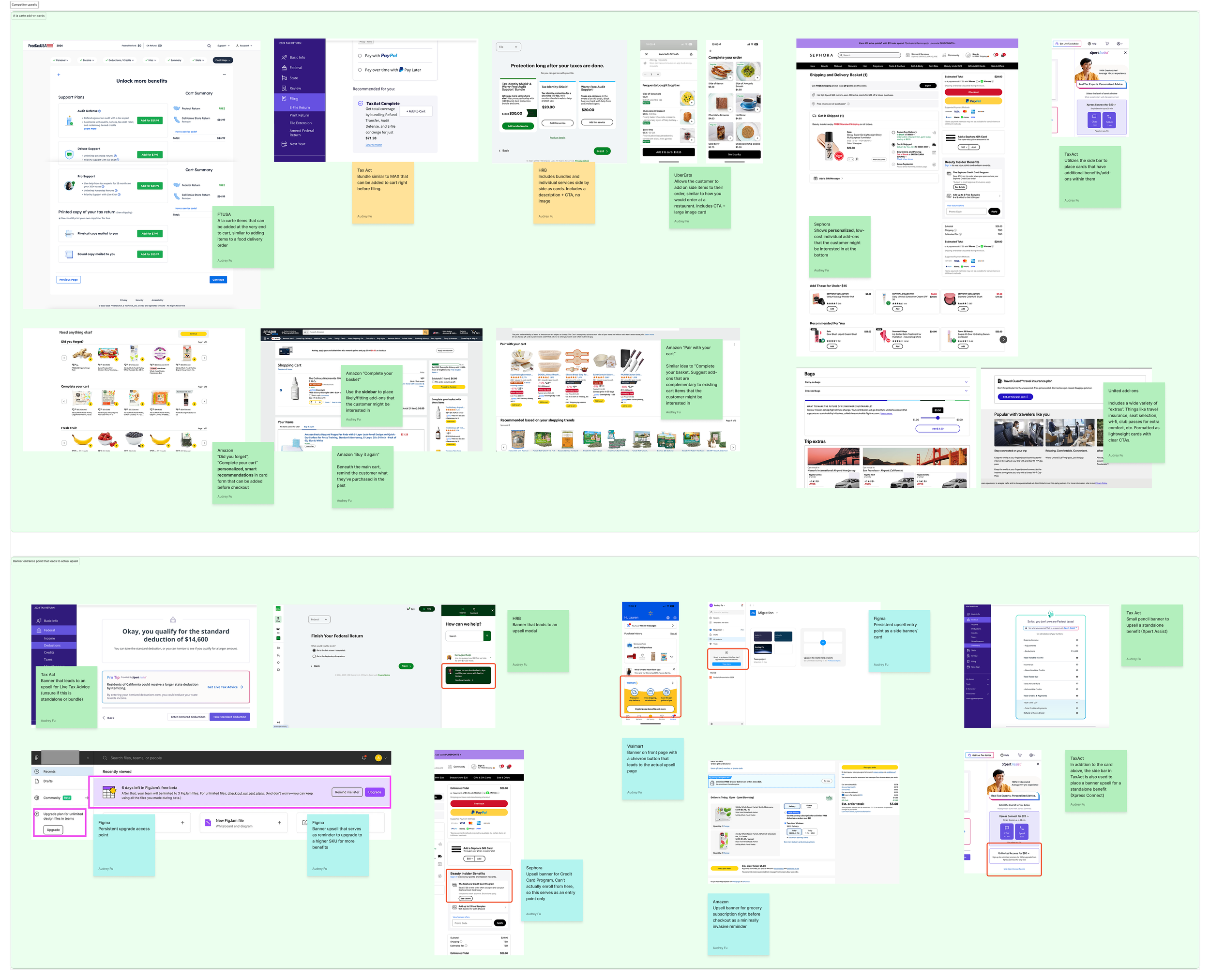
When auditing external examples, I looked for common themes and patterns - when is each type of format used, and what factors determine their differences?
Expert Final Review was only the first step in a broader strategic initiative that would result in more modularized upsells in the future. How could I design it to slot into scalable system that didn’t exist yet?
Expert Final Review was meant to capture customers at their highest point of need, providing the necessary confidence for them to finish filing. In order for this offer to feel contextual and relevant, it couldn’t be the same fullpage comp chart format that customers were already developing ad blindness towards. An embedded upsell widget surfaced directly on screens with the highest drop off rates would be the optimal way forward. Meanwhile, there was also the challenge of where to surface this offer.
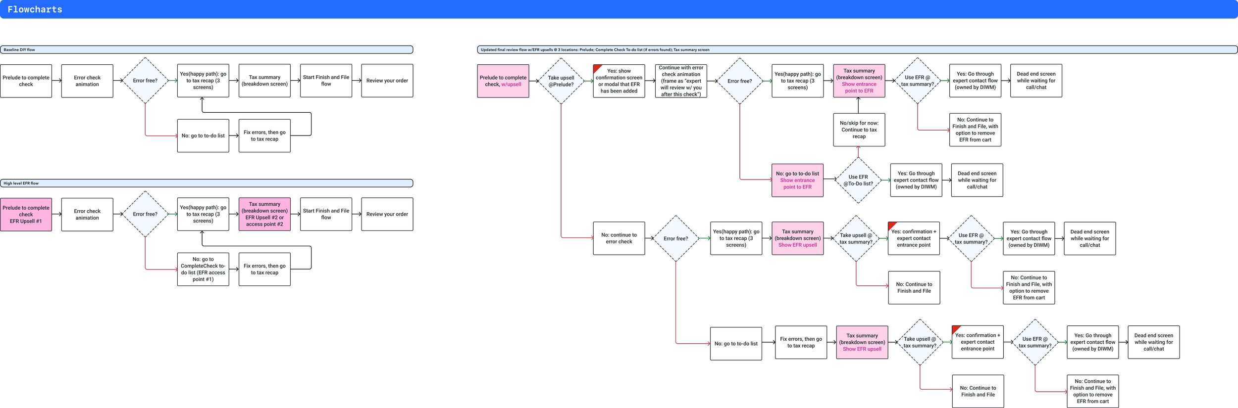
Historically, offers were hard coded to show at specific points in the tax filing flow. For EFR, the optimal placements would be different depending on each individual customer’s situation, which meant that we needed to use a predictive AI model to determine where and when to show it — if at all. The problem was that we didn’t have enough time to perfect this model before launch. In the meantime, we narrowed in on 3 different locations to show the offer, evolving the flow into a complicated web of potential pathways.
There was also the question of how to split out the existing expert contact experience from DIWM and bring it to DIY customers: What should the one-time expert contact experience look and feel like? How much can we borrow from the existing expert assisted products before the experience begins to cannibalize traffic from our other offers? And before all of that, how much leeway do my engineers have to make changes to our existing widgets? As it turned out, not a whole lot.
KEY TRADEOFFS
Navigating tradeoffs for MVP launch
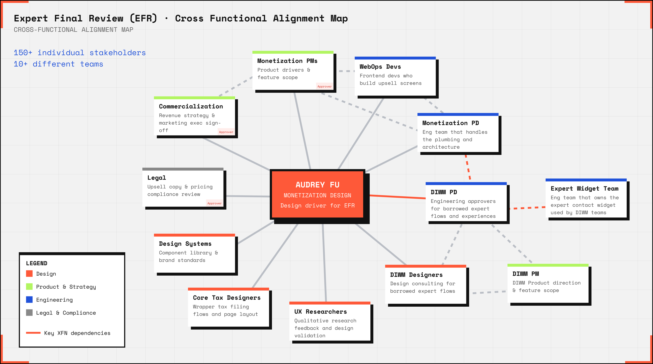
With more than 10 different teams and 150+ stakeholders involved on this workstream, it was extremely challenging landing on a user experience that everyone could align on for MVP.
Experiments in the monetization space always carry a direct revenue impact, resulting in high sensitivity and aversion to change. The political landscape for EFR was especially delicate, because it would borrow capabilities from the Do-It-With-Me (DIWM) product — the original expert-assisted service level upgrade that EFR was meant to be a “lite” version of. Every divergence from the existing capabilities would result in additional work for the original capability owners, and a series of approvals that could slow us down. At the same time, too little divergence, and we’d cannibalize DIWM revenue and lower our ARPC overall.

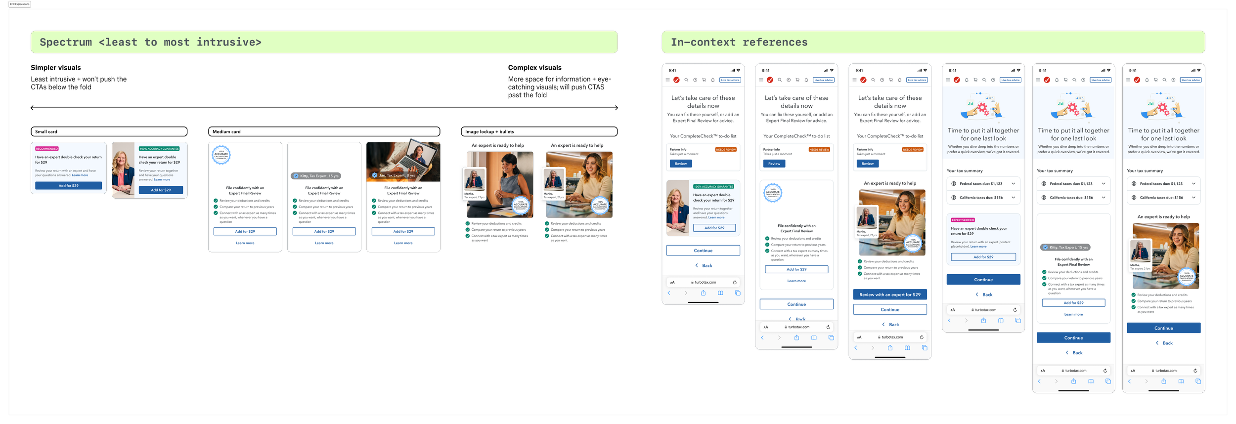
Using a historically proven format over an experimental one for MVP
My instinct was to design an embedded offer card. This pattern is highly contextual, personalizable, and modular enough to scale across placements. But embedded formats weren’t enabled yet in our AI recommendation engine, and building a new offer paradigm would have cost us weeks we didn't have. There was also concern from my finance and commercialization SLT stakeholders, and a desire to stick with our existing ‘Compchart’ format. Qualitative research showed that customers hated the disruptive ad-like compcharts, but the conversion data was undeniable. Pivoting away from a proven winner was too risky for an initial launch meant for learning, and we ultimately aligned on a full-page compchart format to unblock launch.
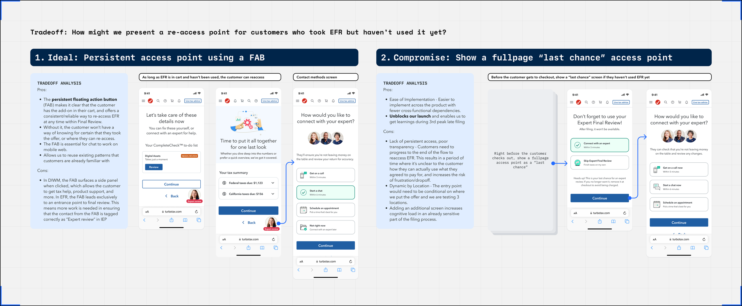
The most consequential tradeoff was in deciding how we would provide customers a way to re-access EFR once they had added it to cart. If they chose not to use their one-time expert contact immediately, they would need a highly discoverable re-access point. The ideal solution was to use a persistent floating button, an existing pattern used to keep expert contact available throughout the flow for the expert-assisted product. But implementing the change so that this button would disappear once the one-time contact was consumed would require 3 extra weeks of work from the original capability owners, and we were already strapped for time trying to make the October deadline. I proposed a compromise, and we moved forward with a fixed full-screen access point instead. This unblocked our October launch, and ensured that we didn’t miss our precious learning window.
The one-time review experience itself largely mirrored the experience offered in the expert assisted service level, with the main difference in EFR’s ‘lite’ version being that it could only be used one time. By reusing existing capabilities over creating new ones, we were able to launch the MVP quickly and in time for the October late filing deadline.
Initial launch results
5% take rate (vs 1.5% dry test), validating upsell screen design and proving demand for the product
2% lower revenue and 8% lower completion rates than baseline, indicating issues with offer experience and expert contact flow
Take rates exceeded our expectations, and we succeeded in learning that there was real demand for this net new offering. Despite that, lowered revenue and completion rates indicated that there was something going on during the actual expert contact experience that was causing eventual dropoffs and detaches. EFR wouldn’t be viable without going through improvements.
PHASE 2: OPTIMIZATIONS
Leveraging live data to push for a better experience
Optimizing the creative format for better attach rates
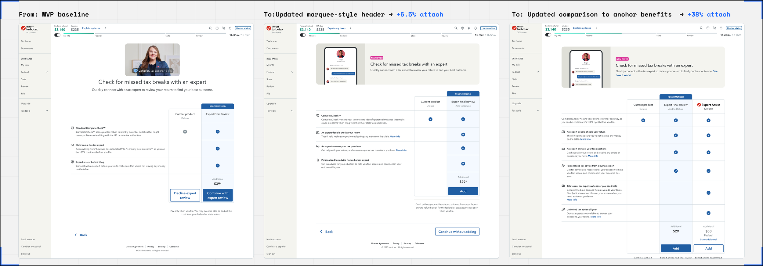
From live customer interviews and post-MVP launch data, we learned that customers were confused about what EFR actually included. EFR’s upsell visuals and language were too similar to that of the existing expert assisted service level, leading to a mismatch in expectations.
I updated the header creative and remade the visual so it showed a realistic chat engagement rather than a generic expert photo. The reason for this shift was that in third peak, we saw that out of the customers who did end up contacting an expert, more than 70% of them opted to chat. Showing a chat as the visual would serve as a more realistic representation of what most customers would end up getting out of EFR. We AB-tested this in prod alongside the original, and saw a 106.5% index to control increase in attach rates from just this visual change alone.
Next, I looked at the content inside of the comparison chart. In our MVP, EFR was presented as a complete standalone, compared against the customer’s existing product. Without anything to anchor against, this made EFR feel extremely similar to the full upgrade. I added a separate column, showing a three-way comparison between the current product, EFR, and the full upgrade so that customers could see exactly what they were getting for the price, and properly assess EFR’s value before making a decision. With this change, attach rates rose up to 138.0% ITC against the MVP attach rates.
Persuading crossfunctional stakeholders with data-driven rationale
Before our MVP shipped, I had recommended a persistent floating button as the re-access point for EFR. The recommendation was overridden for timeline and execution risk reasons, and we launched with a fixed interstitial screen instead.
The 3rd peak data gave me what I needed to reopen that re-entry point conversation. About 20% of customers who took EFR navigated away from the contact flow without selecting a contact method, and had no clear way back due to the lack of a persistent access point. The interstitial screen wasn't accessible or discoverable enough to solve the re-access problem, causing drop-off and frustration.
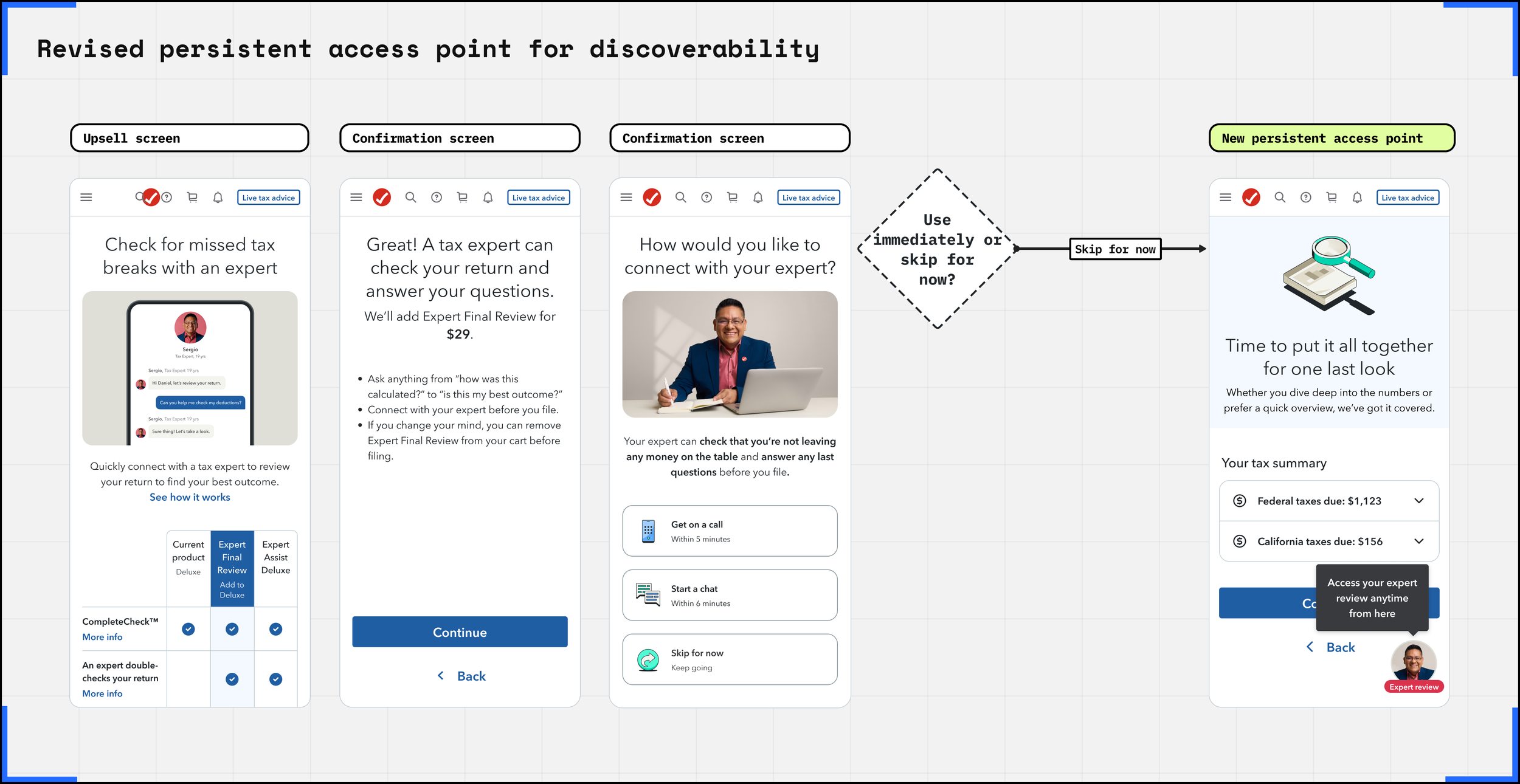
I built the case for the persistent floating button I had originally proposed, now backed by behavioral evidence rather than design rationale alone. Working with my PM, we used that data to make the argument to cross-functional stakeholders and leadership that the upfront engineering investment was worth it, and got it on the roadmap for 1st peak.
OUTCOMES
Key metrics and results
For our post-MVP launch, the cross functional team had more time to align on the features and make sure that we were allocating enough resourcing to build out all of the experience improvements. We launched a second version of EFR with the following changes:
The upsell screen was updated with the winning header (+6.5% attach) and a clearer benefit comparison matrix to help customers with offer comprehension (+38% attach).
A persistent access point was added to the experience. As long as the customer has EFR in their cart and hasn’t used it yet, they can initiate their expert review anytime from a floating button on screen.
Instead of placing the upsell in fixed locations like we did in MVP, we switched to AI model-driven upsell targeting. The optimal placement is different depending on each individual customer’s situation, and not all customers are suitable targets for EFR - the engine would decide where and when to show the upsell.
After launching these changes, we saw the following results.
Take rate
The % of customers who added EFR to cart. The increase in take rate helped validate that there was real demand for EFR as a net new offering, and that the updated offer design was resonating with customers more effectively.
+15%
Attach rate
The % of customers who checked out and completed payment with EFR in cart. With the second launch, customers completed filing at much higher rates than before, indicating 3 things:
Customers saw the value of EFR.
They were able to use their 1-time expert contact successfully, validating our efforts to improve the contact experience and re-accessibility.
The 1-time expert review brought enough perceived value for them to complete their filing in TurboTax.
+49%
Detach rate
Detach measures the % of customers who removed EFR from their cart prior to checking out. One of the biggest problems we saw after the MVP launch was that despite customers showing clear interest in EFR as an offer, many of them never initiated actual expert contact, simply detaching it from their cart before checking out. By improving the contact flow experience and allowing customers to re-access EFR at any time, customers consumed EFR at higher rates, making a significant impact on detach rates.
-26%
Revenue positive?
Was the incremental revenue from EFR enough to offset the cannibalization of other offers that it caused? Any time a net new offering is added to the monetization portfolio, its performance needs to be measured against existing offers to see if its addition is a net positive. In this case, customers taking one-time expert review in the form of EFR may result in fewer customers upgrading to the full expert-assisted service level.
Post-MVP, we switched from our initial static placements to AI model-driven targeting. The model ensured that the offer would be shown at the right time, right place, and to the right cohort of customers, resulting in revenue positivity.
Yes
Looking ahead
EFR's first full season demonstrated real demand for standalone expert access as a modular add-on, and more importantly, served as a proof of concept for a new modular monetization model.
TurboTax has historically monetized through service tiers — bundles where customers upgrade to get more. EFR is a different bet: that customers will pay for a specific, high-value capability at the moment they need it, without committing to a full bundle upgrade. It's still too early to declare modularization the future of TurboTax monetization, but EFR is a meaningful first proof point that the direction is worth pursuing.
The season also validated the investment in our AI-driven offer recommendation model, which was key in identifying the right customers and right moments to surface EFR. Looking ahead, the model’s ability to suppress, promote, or sequence offers based on real-time customer context becomes increasingly critical.
So what’s next? To fully leverage the power of our AI-driven offer recommendation model, we need to build out a design framework that enables real-time granular personalization. Every individual upsell screen still needs to be manually designed and built as a static screen, which prevents the model from dynamically personalizing based on real-time signals coming from the customer. To truly personalize upsells based on each individual user’s context, inputs, and other signals, the model needs to have access to a broader library of component-like formats suitable for a variety of situations that can be switched out freely and flexibly. Building out this new framework is the next challenge for design, and will enable a more contextual, personalized end customer experience.